We brainstormed ideas that ranged from ultra-minimal flows to gamified story experiences.
The tension lay between speed and depth — how to gather meaningful data without scaring users away.
Redefining how people connect online through empathy, clarity, and trust.
MeetAmore
TL;DR
MeetAmore started with one simple idea
what if dating apps actually helped people connect emotionally, not just physically?
I joined their team to turn that idea into a real, human experience. Through research, I realized most people were tired of the “swipe culture.” They didn’t want another hookup app — they wanted something that felt intentional, something that helped them understand themselves before meeting someone else.
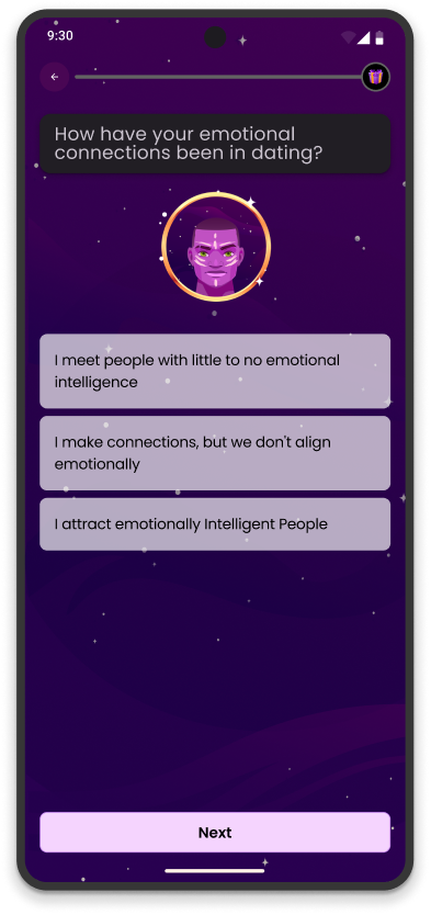
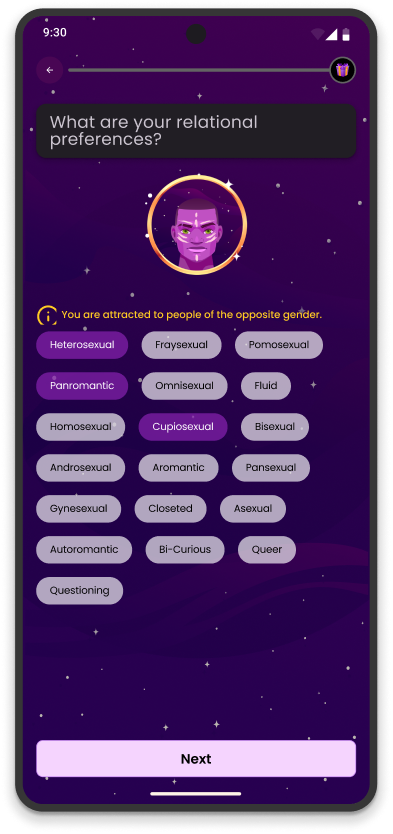
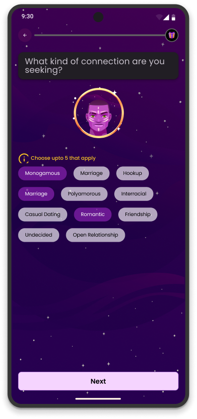
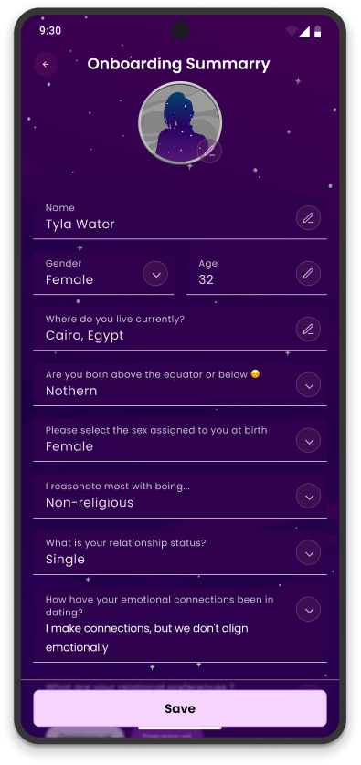
So, I designed a journey that starts with emotional intelligence. Users take short EQ-based reflections, learn a bit about how to love and communicate, and then get paired with people who align on a deeper level.
It’s dating; but with emotional depth. And that’s what made MeetAmore stand out.
Mobile App2024-2025
Social Networking & Technology
Role
- Lead Product Designer
- UX Researcher
- Interaction & UI Designer
- Emotional Design Strategist
- Assistant Usability Tester & Iteration Lead
Where Most Love Stories End Before They Begin
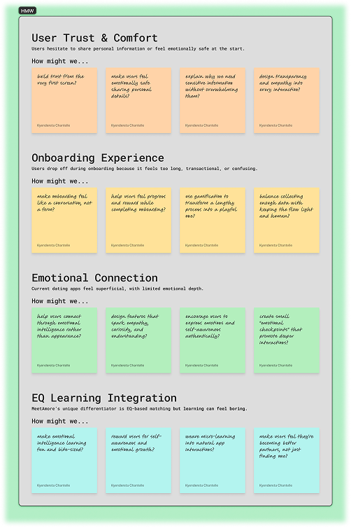
Problem Statement & Context
It was almost midnight when our analytics dashboard exposed an uncomfortable truth:
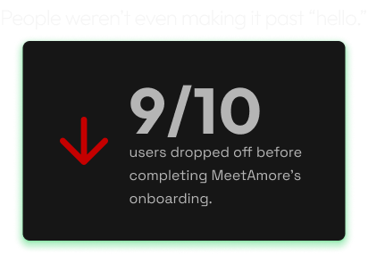
For a startup promising emotional connection through emotional intelligence, this irony hit deep. The mission was inspiring; but the very first interaction felt mechanical.
If we couldn’t help users trust us in the first few minutes, how could we help them trust each other?
That realization set off a mission: to redesign onboarding into something that felt human — guided, warm, and worthy of emotional confidence.
Goal: Build trust before asking for it.
The World We Were
Building For
Context & Industry Understanding
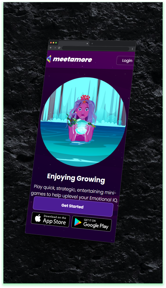
MeetAmore is a social networking startup redefining online dating. Unlike Tinder or Bumble — where swipes rule and emotional connection takes a backseat.
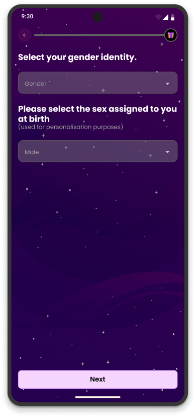
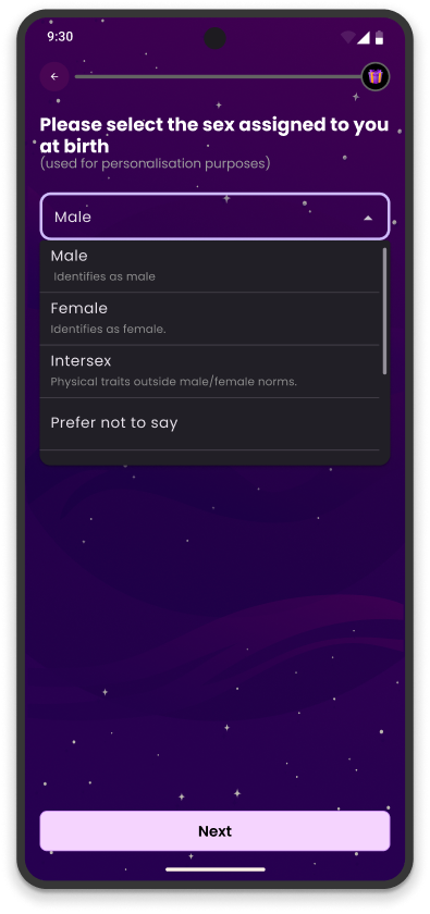
MeetAmore uses emotional intelligence (EQ) to pair users who understand and connect on a deeper level.
Users complete short EQ modules and are matched based on their emotional compatibility scores.
Initially focused on the U.S., the startup planned expansion to Kenya, targeting an audience seeking more intentional, emotionally grounded relationships.
The business goal was crystal clear:
Create a dating experience rooted in authenticity; where EQ drives connection, not appearance
But with users leaving before even signing up, authenticity needed a better entry point.
Listening Between the
Lines
Context & Industry Understanding
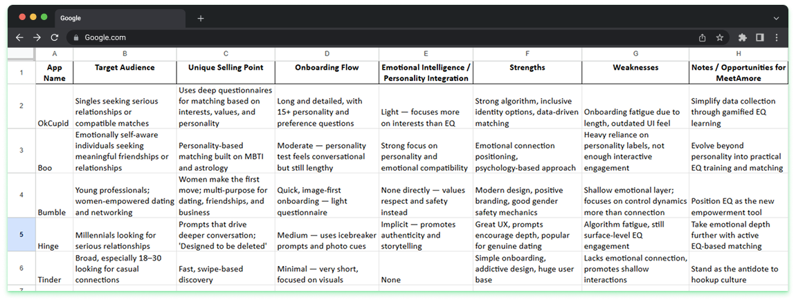
With limited research time, I focused on three quick yet insightful methods:
Competitor Analysis
Studied how top dating apps (Tinder, Bumble, Hinge) onboarded users.
Usability Tests
Observed 5 participants attempt the old flow via screen recordings.
Desk Research
Explored psychology of digital vulnerability and user motivation.
With limited research time, I focused on three quick yet insightful methods:
“It just felt like I was filling out a government form, not starting a connection.”
That insight revealed a deeper truth: our users weren’t frustrated by length; they were disconnected from emotion. The process lacked empathy, warmth, and transparency
Defining the Heart of
the Problem
Define — Framing the Core Problem
From these insights, I defined our challenge:
How might we reduce onboarding drop-off without sacrificing the emotional depth and data accuracy needed for authentic matches?
Success metrics were simple but bold:

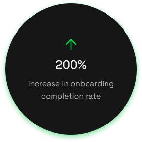
10% → 30%
Increase onboarding completion rate from
Gain user trust
Improve user trust and motivation during signup
This wasn’t just about getting users in — it was about inviting them in emotionally
Rewriting the First Hello
Ideate — Reimagining the First Impression
We brainstormed ideas that ranged from ultra-minimal flows to gamified story experiences.
The tension lay between speed and depth — how to gather meaningful data without scaring users away.
After rounds of sketches, critiques, and spirited Slack debates, one idea emerged:
“Let’s make onboarding feel like a guided conversation, not a questionnaire.”
We envisioned an experience where each step felt like progress toward connection, not bureaucracy.
Key Decision
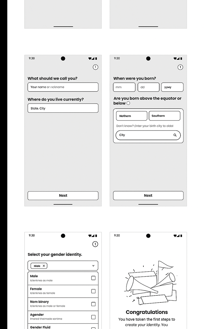
Instead of removing questions, I chose to humanize them. We kept the depth — but added empathy through microcopy, tone, and pacing.
Designing for Trust
Design — Bringing It All Together
The redesigned onboarding embodied MeetAmore’s mission; emotionally intelligent design for emotionally intelligent people.
Key Design Choices:
Gamified Progress
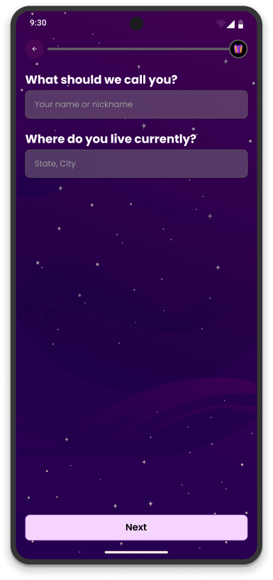
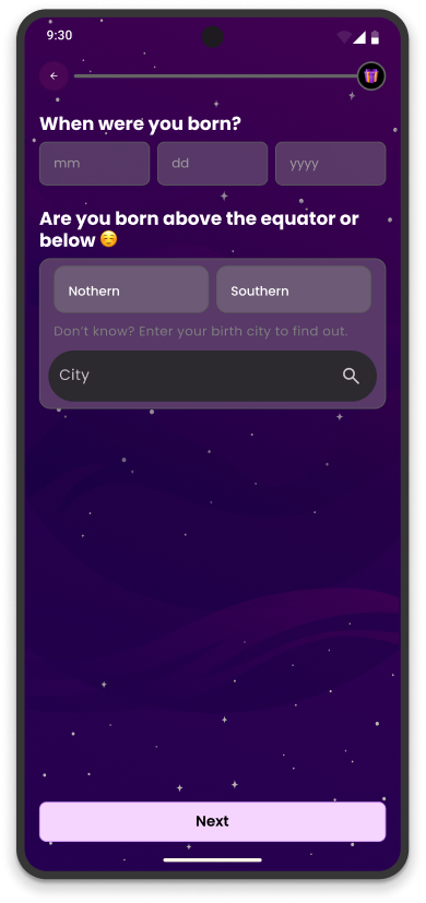
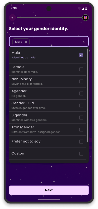
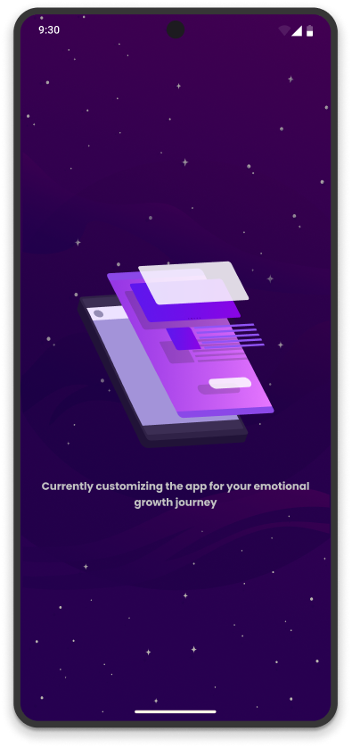
Added a dynamic progress bar that unlocked subtle micro-animations at each stage, rewarding completion.
Conversational Copy
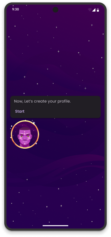
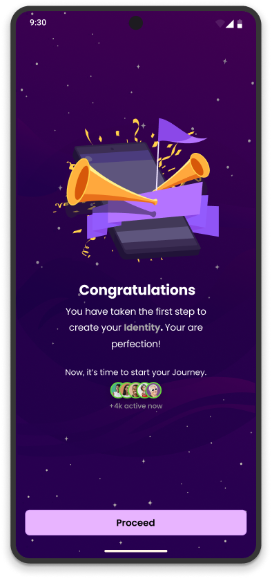
Rewrote every line of text to sound like a dialogue (“Tell us what makes you, you”).
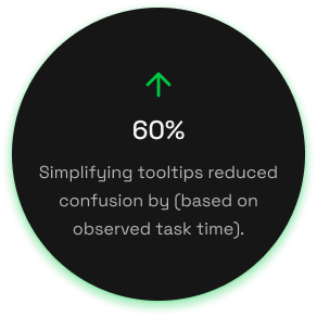
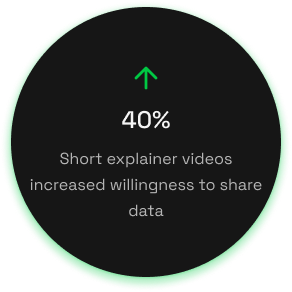
Transparency Elements
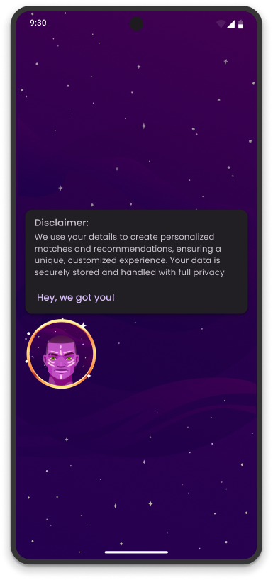
Added tooltips and mini-modals explaining why we requested personal info.
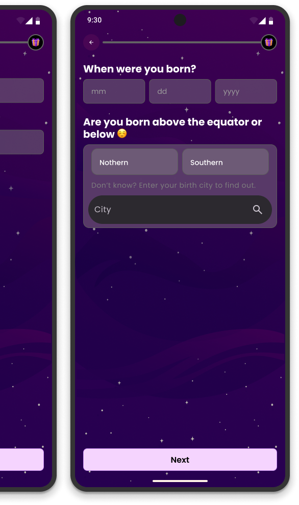
Visual Tone
Embraced soft gradients of lavender and cream — colors linked to calmness and trust.
Key Design Choices:
Initially, I wanted richer animations to add delight, but usability tests showed they slowed the experience. I scaled them down to micro-interactions — keeping the emotion but enhancing performance.
Defining the Heart of
the Problem
Success metrics were simple but bold:
Define — Framing the Core Problem
LESSONS IN EMOTIONAL
DESIGN
Reflection — Lessons & What’s Next
Empathy is measurable. When users feel seen, engagement rises.
Transparency builds trust. Clarity reduces hesitation more than any incentive.
Gamification can be functional. It transforms friction into motivation.
Constraints spark creativity. Limited time pushed sharper prioritization and focus.
I extended these emotional design principles across other touchpoints — chat, profile setup, community, e.t.c to ensure every interaction felt as genuine as the connections we hoped to create.

VIEW MORE PROJECTS
Let’s build something meaningful
together; reach out and let’s turn
ideas into impact.
Let’s Collaborate