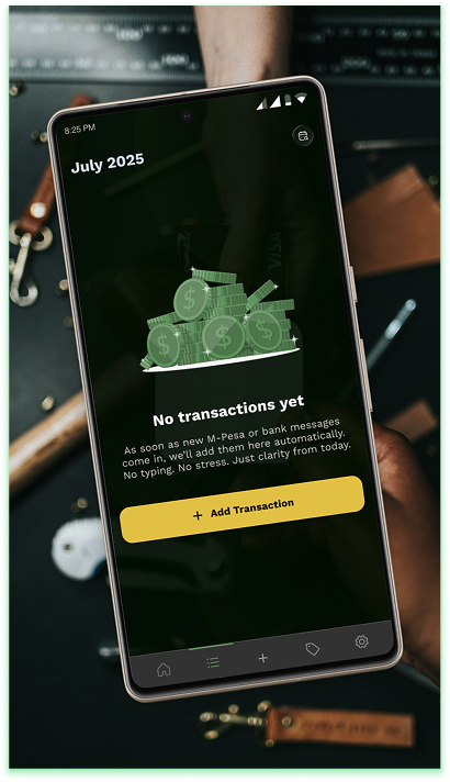
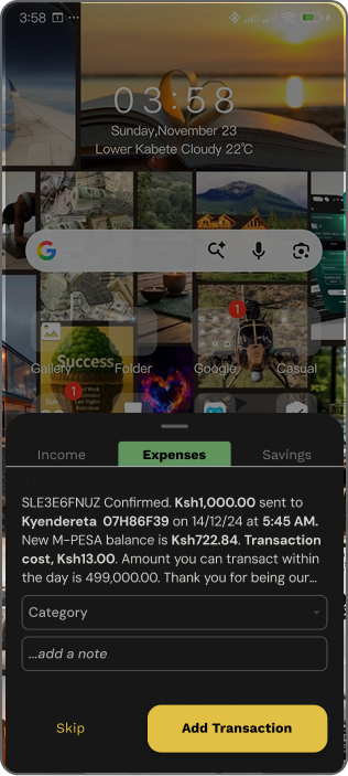
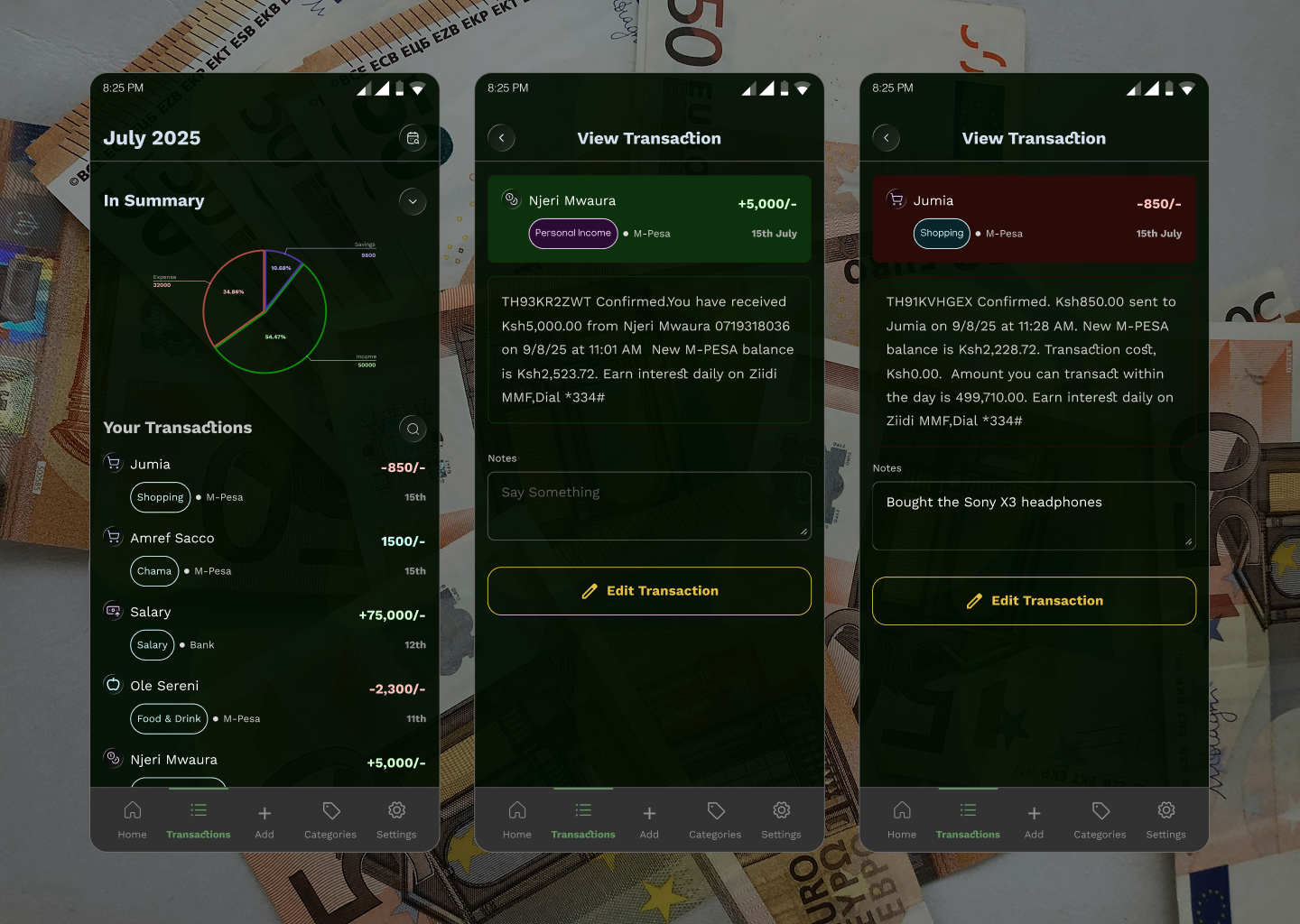
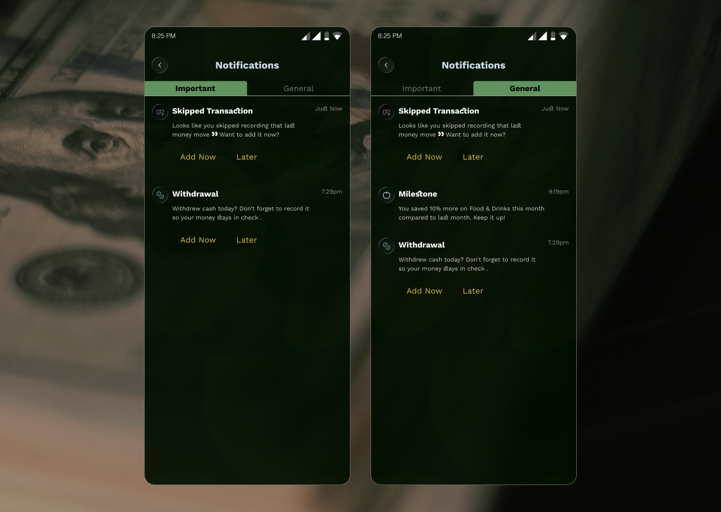
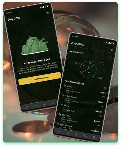
- Instant transaction pop-ups created awareness without annoyance.
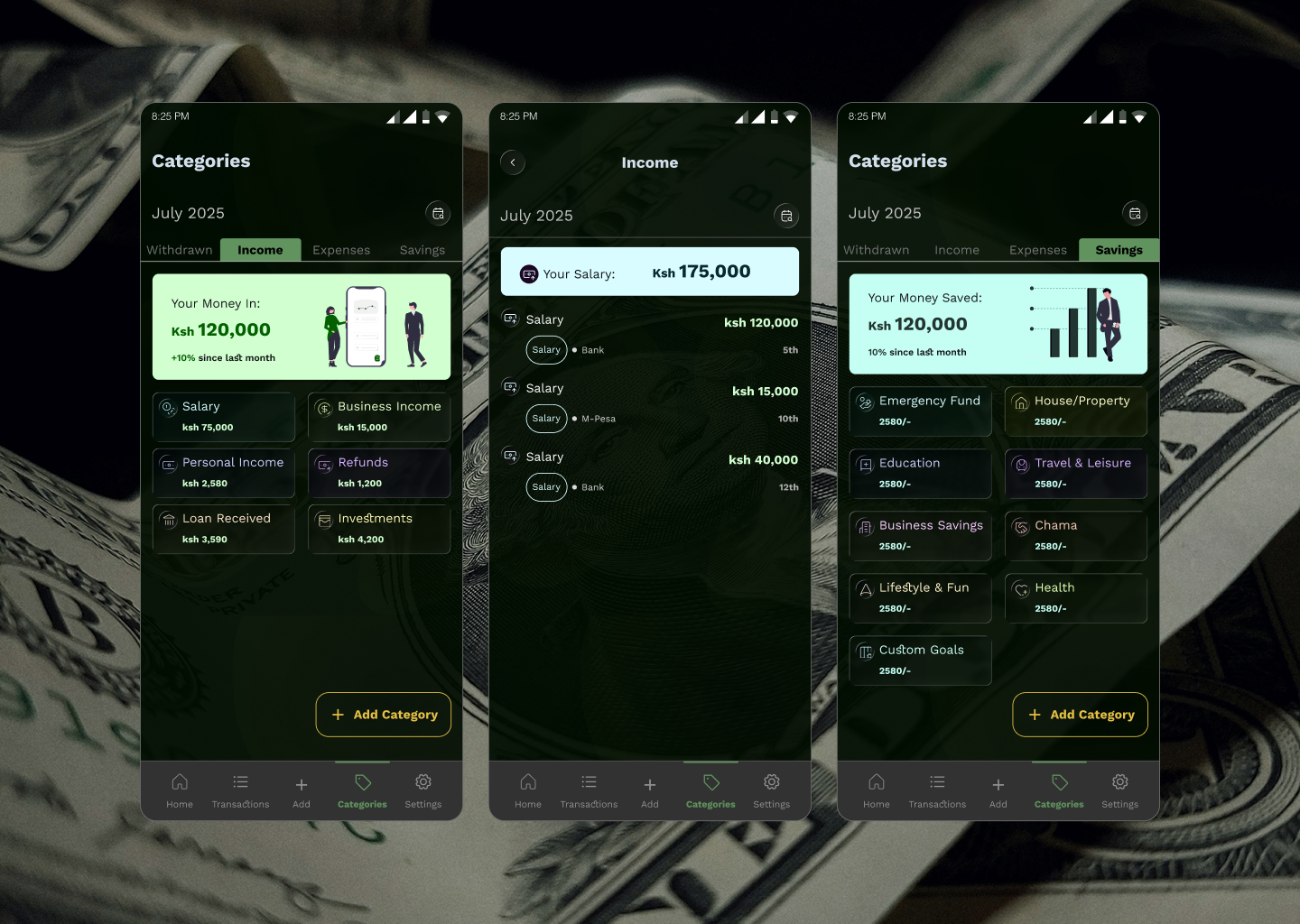
- Simplified navigation (Home, Transactions, Add, Categories, Settings) improved orientation.
Reimagining personal finance with calm, automation, and effortless clarity.
Kifedha
TL;DR
Kifedha is a finance app designed for busy people who want effortless financial awareness without the hassle of manual tracking.
Busy people struggle to consistently track their expenses because existing finance apps demand too much time and mental effort.
Born from the frustration of forgetting to record transactions, it automatically reads mobile payment notifications, gently reminds users to categorize spending, and provides clear, calm insights through a minimalist, night-mode interface.
Built with simplicity, automation, and trust in mind, Kifedha removes friction from daily finance management, allowing users to track their money without thinking twice while maintaining a serene and intuitive experience.
Mobile App2025fintech
Team
- Kyendereta Chantelle – Lead Product Designer
- Elvis Mariga – Project Manager
- Augustine – Android Developer
- James Mwangi – Senior Developer
My Role
- Lead Product Designer
- UX Researcher
- Interaction & UI Designer
- Emotional Design Strategist
- Assistant Usability Tester & Iteration Lead
Where Good Intentions
Get Lost in Transactions
Problem Statement & Context
It started with a familiar frustration.
Between client calls, errands, and endless notifications, I realized I hadn’t recorded my expenses in three days. Again.
Like many people who rely on mobile payments, I wanted to track my spending; but by the time I remembered, the details were fuzzy. It wasn’t a lack of discipline; it was simply life moving faster than memory.
That moment became the seed for Kifedha, a finance app that automatically tracks transactions going through your phone — built for busy people who want financial awareness without the effort.
Goal: Simplify financial tracking through automation and smart reminders.
The World We Were
Building For
Context & Industry Understanding
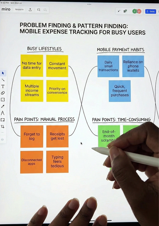
In Kenya, mobile money has become the backbone of daily transactions. Between M-Pesa, banking apps, and digital wallets, users make dozens of micro-transactions every week — yet most apps still rely on manual entry to track expenses.
That gap created a behavioral paradox:
People care about financial control, but hate the effort it takes to maintain it.
Kifedha set out to remove friction, not by reinventing finance, but by making financial tracking invisible.
Listening Between the
Lines
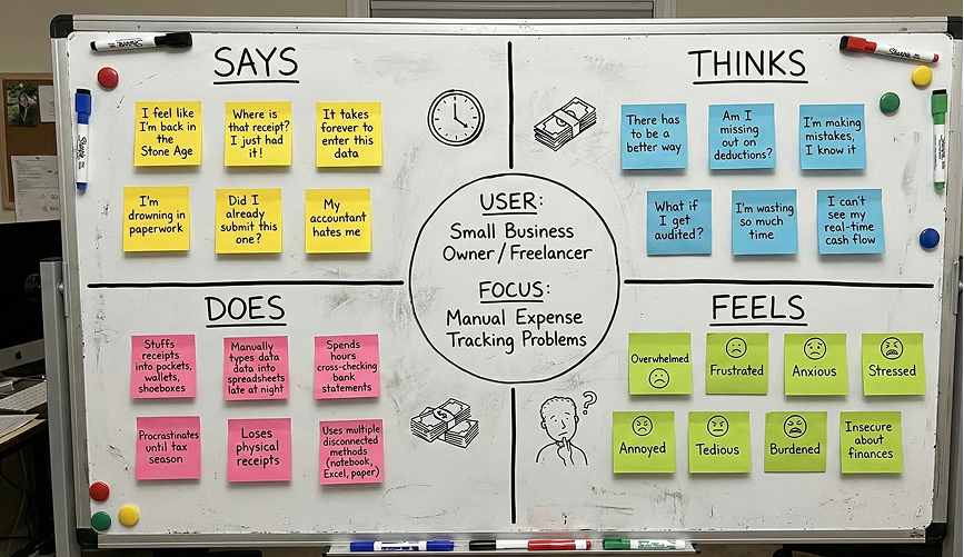
Empathize — Understanding the User
Research was lean but focused.
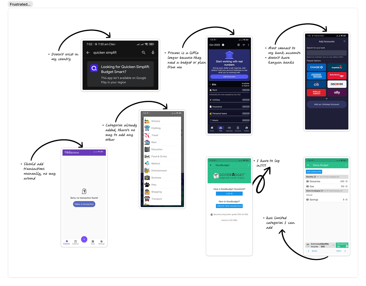
I conducted desk research and competitive analysis, reviewing top finance trackers across Kenya and global markets.
Most apps require manual expense entry
a deal-breaker for consistency.
Users crave automation and simplicity
not budgeting complexity.
Financial apps should feel trustworthy and calm
not intimidating
A single comment from a tester reframed everything
“I love seeing where my money goes… I just don’t want to think about it every day.”
That became our north star — effortless awareness.
Defining the Heart of
the Problem
Define — Framing the Core Problem
Busy people who rely on mobile payments rarely track their expenses consistently because the process is manual and time-consuming.
How might we design a finance app that helps users stay aware of their spending without disrupting their day?
Success metrics were simple but bold:
Increase in daily active users.
Higher percentage of automatically categorized transactions.
Positive sentiment around ease of use.
This wasn’t just about getting users in — it was about inviting them in emotionally
We explored two core flows
We brainstormed ideas that ranged from ultra-minimal flows to gamified story experiences.
The tension lay between speed and depth — how to gather meaningful data without scaring users away.
After rounds of sketches, critiques, and spirited Slack debates, one idea emerged:
“Let’s make onboarding feel like a guided conversation, not a questionnaire.”
Automatic Tracking Flow
When a user makes a transaction, Kifedha reads the payment notification.
A pop-up appears instantly, allowing them to categorize or add a note.
If skipped, they’re reminded later in the evening — gentle, not intrusive.
If ignored again, they’ll see it upon reopening the app.
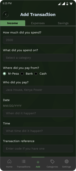
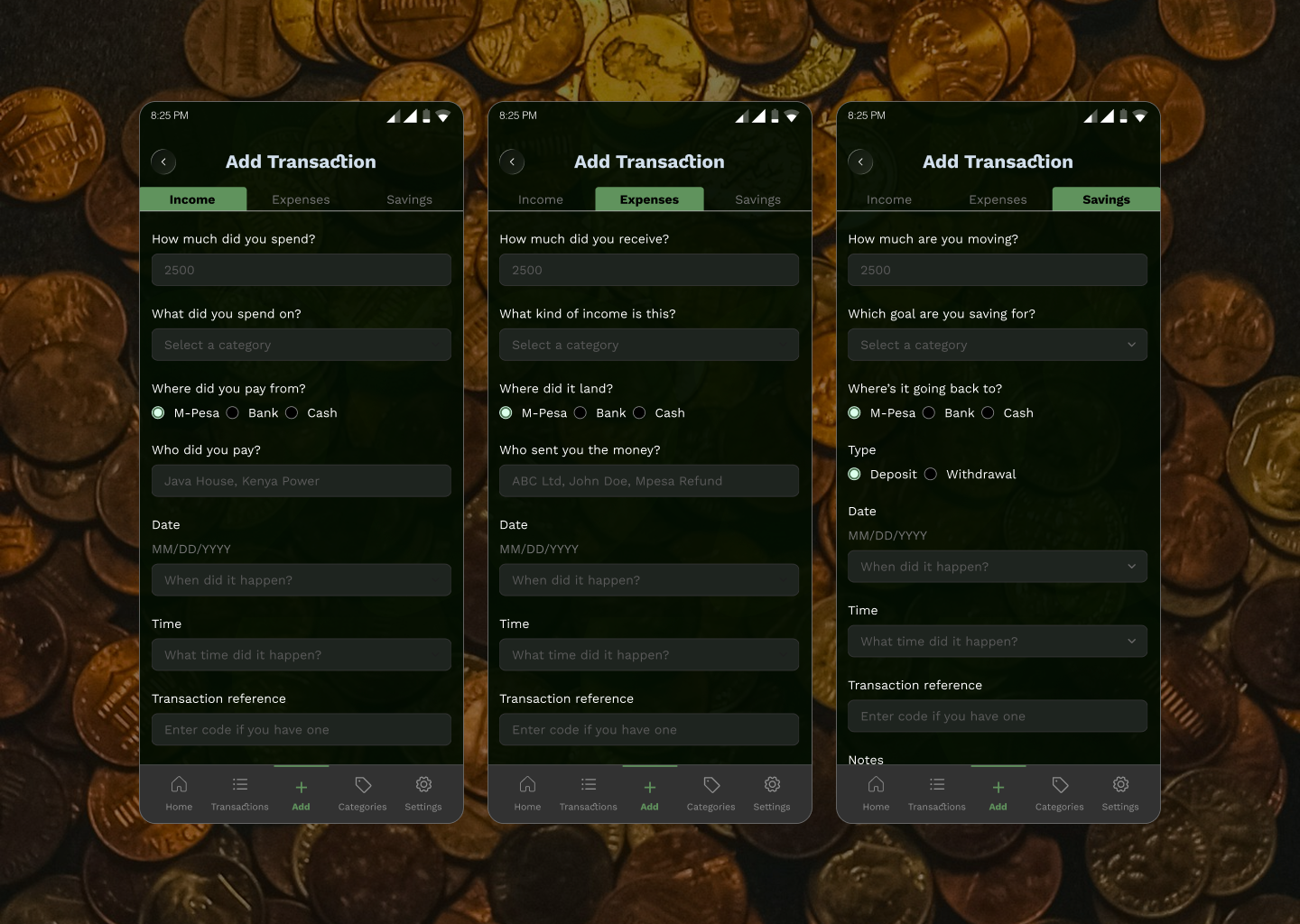
Manual Tracking Flow
Users can also add transactions that didn’t pass through their phones (e.g., cash).
They can view money in / money out summaries and category insights on the home dashboard.
Designing for Calm,
Focused, and Familiar
Design — Bringing It All Together
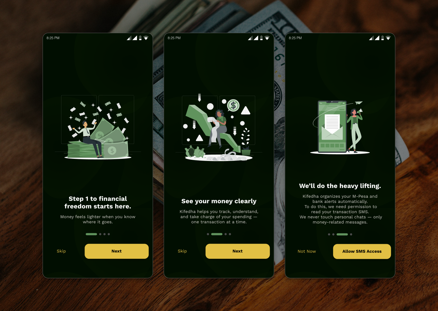
The visual direction embraced the quiet confidence of finance: deep greens, warm neutrals, and gold highlights symbolizing value and trust.
Each screen was built to feel like a night mode that helps you think clearly, not stare harder.
Typography was bold but minimal. Spacing generous. Motions subtle.
Key Design Choices:
Dark green base for security and calm, contrasted by yellow CTA highlights.
Rounded sans-serif for warmth and approach-ability.
Thin-line icons — precise, non-intrusive.
User Testing Takeaways
LESSONS IN EMOTIONAL
DESIGN
Reflection — Lessons & What’s Next
Simplicity wins loyalty. Every extra feature risks becoming friction.
Automation builds trust when it’s transparent, not intrusive.
Good UX feels invisible. The best compliment is when users forget they needed you.
Clarity in design handoffs is as powerful as clarity in UI.
Designing Kifedha taught me that automation isn’t about removing effort — it’s about respecting attention.

VIEW MORE PROJECTS

Let’s build something meaningful
together; reach out and let’s turn
ideas into impact.
Let’s Collaborate