Case study · Shipped product · 2024–2025

Meetamore: building trust before asking for it.

The short version

Meetamore is a dating app with an unusual bet: match people by emotional intelligence, not appearance. Users learn EQ through gamified, Duolingo-style lessons — and the further they progress, the deeper their matches get.

The problem: people were leaving before they even finished signing up. For a product promising emotional connection, the first interaction felt like paperwork. I redesigned onboarding to feel like the beginning of a relationship instead of the beginning of a form — and connected its reward directly into the product's core lesson loop.

Role

Lead Product Designer — and the only product designer on the whole product

Platform

Mobile app, iOS & Android

Market

US adults, 30–60 — tired of swipe culture, planned expansion to Kenya

Focus of this study

The onboarding redesign — one problem, told properly

The problem

Love stories were ending at the signup form.

The analytics told an uncomfortable story: users were arriving with intent — they'd downloaded a dating app built on emotional depth, on purpose — and abandoning it during onboarding. Completion sat around 10%.

The irony stung. A product whose entire promise was "we'll help you connect emotionally" was opening with an experience that felt mechanical. If we couldn't earn a user's trust in the first three minutes, how were we going to help them trust another human being?

The complication: dating apps genuinely need that data. Age, intent, preferences, emotional baseline — you can't match people meaningfully on an empty profile. So the lazy fix, "just make onboarding shorter," was off the table before we started.

Where the love stories ended.

Original onboarding · before redesign

Users arrived with intent — they had downloaded a dating app built on emotional depth, on purpose — and abandoned it before finishing signup.

100%
−22%
78%
−26%
52%
−24%
28%
−12%
16%
10%
Opened the appStarted onboardingProfile basicsEQ & intent questionsPhotos & verificationCompleted
Only 1 in 10 made it through.
The research

Listening between the lines.

I joined after the product had already started moving, so there was no runway for a long discovery phase. I worked with what the constraint allowed — three fast, honest methods:

Usability sessions

Watched 5 participants attempt the existing flow via screen recordings, sitting in on the PM-led testing sessions.

Competitor analysis

Studied how Tinder, Bumble and Hinge onboard — what they ask, when they ask it, and what they give back first.

Desk research

The psychology of digital vulnerability: what makes people willing to share personal information with a screen.

"It just felt like I was filling out a government form, not starting a connection." — Usability participant, original onboarding flow

That line reframed everything. Users weren't frustrated by the length. They were disconnected from the emotion. The flow asked for vulnerability and offered bureaucracy in return. The problem wasn't the number of screens — it was that nothing about them felt like the beginning of something.

The fork in the road

Cut the questions, or change what they feel like?

The team debated two genuinely defensible directions — this got spirited on Slack:

The obvious path

Strip onboarding to the minimum

Fewer screens, faster completion, industry-standard advice. But every question removed weakened the EQ matching engine — the one thing that made Meetamore worth existing. We'd be trading the product's soul for a conversion bump.

What I chose

Keep the depth. Humanize the asking.

Same questions, transformed delivery: conversational copy, honest explanations of why we ask, visible progress, and a reward that means something. Make onboarding feel like a guided conversation, not a questionnaire.

What I gave up: the quick win. Cutting screens would have moved the completion number fastest and looked good in the next standup. I bet instead that trust, not speed, was the real conversion lever — and that was a harder bet to defend before the results came in.

The design

Emotionally intelligent design, for emotionally intelligent people.

Conversational copy

Rewrote every line to sound like dialogue — "Tell us what makes you, you" — instead of field labels. The tone of the asking became the first proof of the product's promise.

Transparency by default

Tooltips and mini-modals explaining why we request each piece of personal information. Clarity turned hesitation into consent.

Progress you can feel

A dynamic progress bar with subtle micro-animations unlocking at each stage — each step framed as movement toward connection, not admin.

A reward that feeds the loop

Finishing onboarding earns coins that unlock EQ lessons — the product's core. The first reward isn't a dead-end badge; it's a bridge straight into the reason the app exists.

Visual tone followed the same logic: soft gradients in lavender and cream — calm, warm, unthreatening — because the palette had to do trust work before a single word was read.
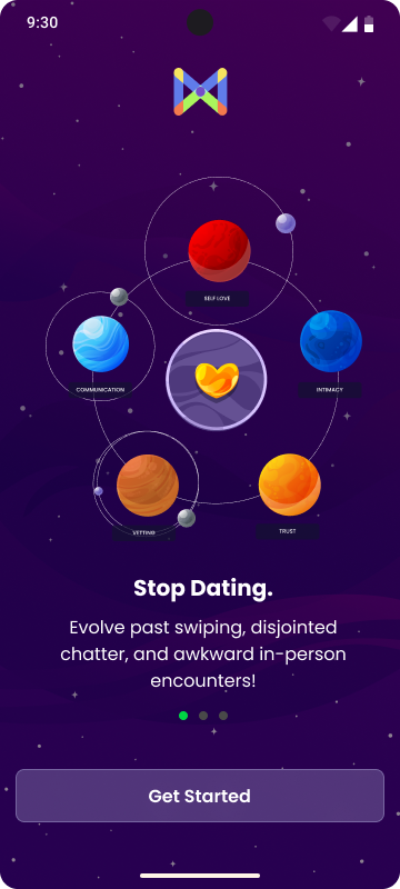
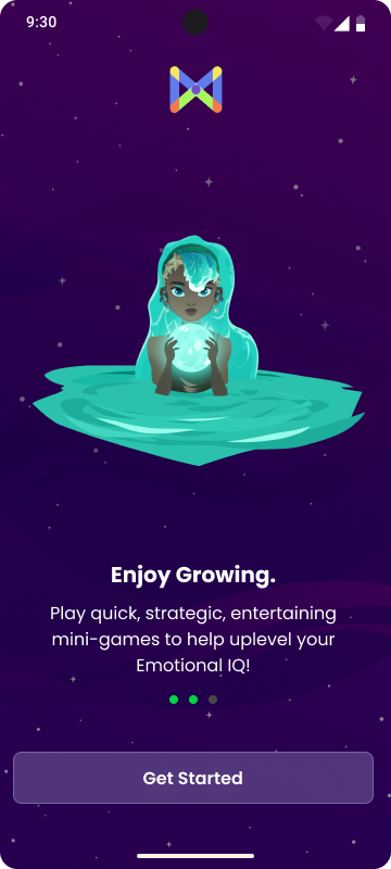
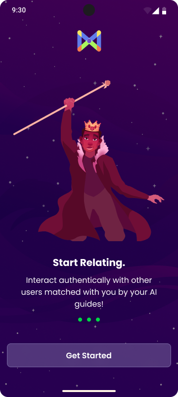
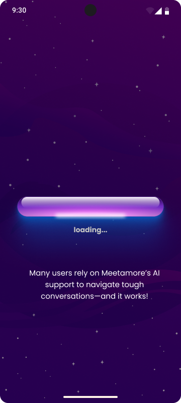
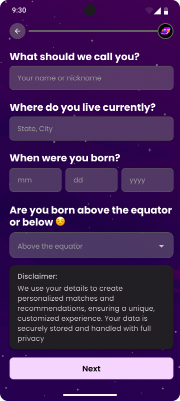
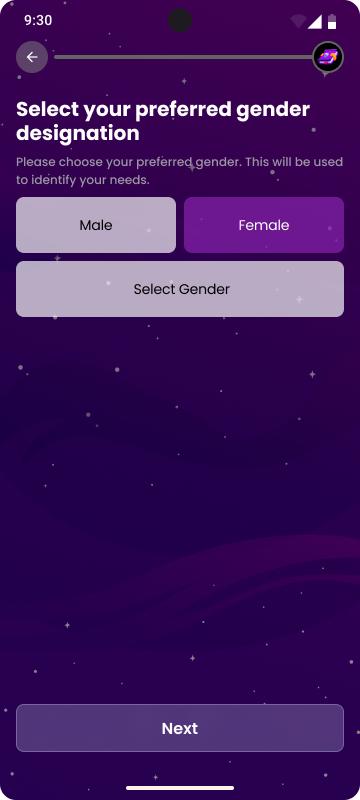
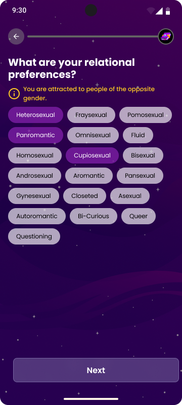
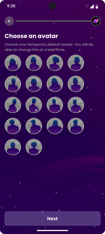
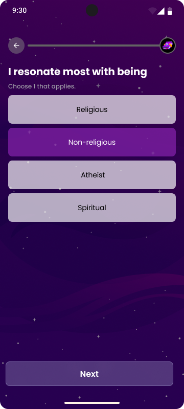
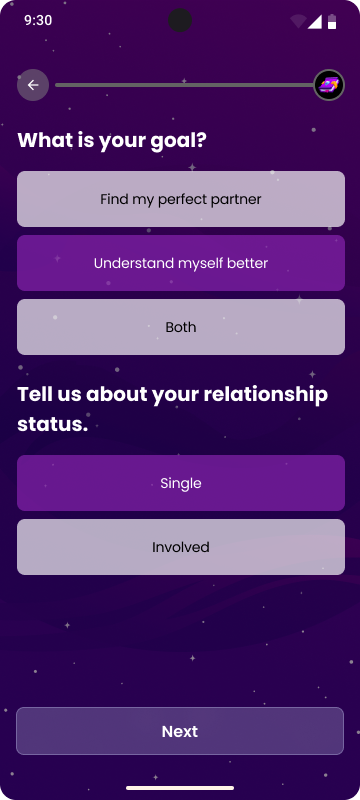
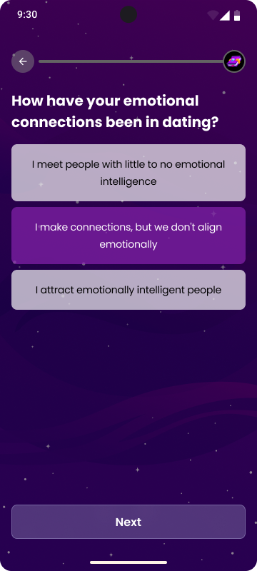
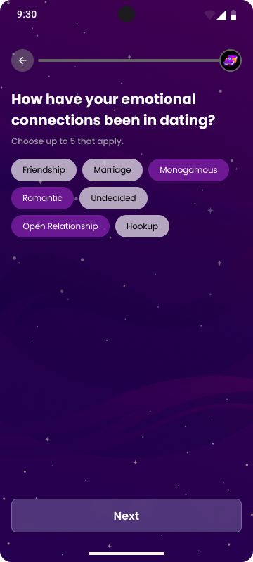
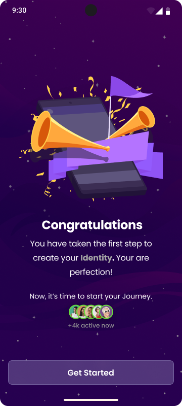
Meetamore onboarding — screen 1 Meetamore onboarding — screen 2 Meetamore onboarding — screen 3 Meetamore onboarding — screen 4 Meetamore onboarding — screen 5 Meetamore onboarding — screen 6 Meetamore onboarding — screen 7 Meetamore onboarding — screen 8 Meetamore onboarding — screen 9 Meetamore onboarding — screen 10 Meetamore onboarding — screen 11 Meetamore onboarding — screen 12 Meetamore onboarding — screen 13

Swipe through the redesigned onboarding flow →

The thing I walked back

I originally designed richer, more delightful animations throughout the flow — and I was attached to them. Testing didn't care. They slowed the experience enough to hurt, so I scaled them down to micro-interactions. The emotion stayed, the friction went, and I learned to hold my darlings a little more loosely.

What changed

The numbers, honestly told.

10% → 30%

The target was to triple onboarding completion from 10%. Final post-launch figures weren't in before my tenure ended — what I can claim honestly: usability testing on the redesigned flow showed users completing it without the drop-off pattern that defined the original.

Funding

The product's design quality helped investors and stakeholders see the vision becoming real — which, in the words of a Meetamore founder, "directly helped us build momentum and secure additional funding."

Beyond the flow itself, the emotional design principles from this work were extended across chat, profile setup and community — onboarding became the template for how the whole product speaks.

"She was our first design hire, and her impact went far beyond making screens look good. She helped us define the product itself… investors and stakeholders could clearly see the vision becoming real. That directly helped us build momentum and secure additional funding." — Isaak Hayes, Founding team, Meetamore
What it taught me

Lessons in emotional design.

Empathy is measurable.

When users feel seen, they stay. You can put a number on that, and we did.

Transparency beats incentives.

Explaining why we ask reduced hesitation more than any reward did. Clarity is the cheapest trust you can buy.

Gamification is functional, or it's noise.

The coins worked because they fed the core loop. A reward that leads nowhere is just decoration with a dopamine cost.

Constraints sharpen judgment.

No discovery runway, one designer, non-negotiable data needs. The limits forced prioritization I'd now choose on purpose.

Next

KDK: building the mentorship I couldn't find.

Read the KDK story
Say hello