Concept project
Case study · Web design & strategy · Kreative Cirkuit

Shapiro Legal: turning a cluttered page into a conversion engine.

The short version

Shapiro Legal is a mass tort litigation firm serving injured people across all 50 states. Thirty years of credentials, real case results, and a homepage doing none of it justice: three competing contact forms, buried trust signals, an 18-second load time, and a design that said "template" when it needed to say "trusted counsel."

This was a self-initiated concept built to prove Kreative Cirkuit's strategy-first approach for the legal category. The redesign didn't start with aesthetics, it started with the psychology of a person in crisis, and rebuilt the page in the order that person needs to be spoken to. The form can wait. The trust, not so much.

Role

Lead Strategist & Designer — Kreative Cirkuit (development: Elvis)

Industry

Mass tort / personal injury law, US nationwide

Scope

Homepage redesign & conversion strategy

Timeline

2 days, brief to built page

The problem

A serious firm with a site that didn't reflect that seriousness.

Mass tort clients are in crisis. They arrive scared, often in pain, frequently unsure whether they even have a case. Many have already been told no by a doctor or dismissed by an insurance company. They don't arrive ready to fill out a form. They arrive needing a reason to trust.

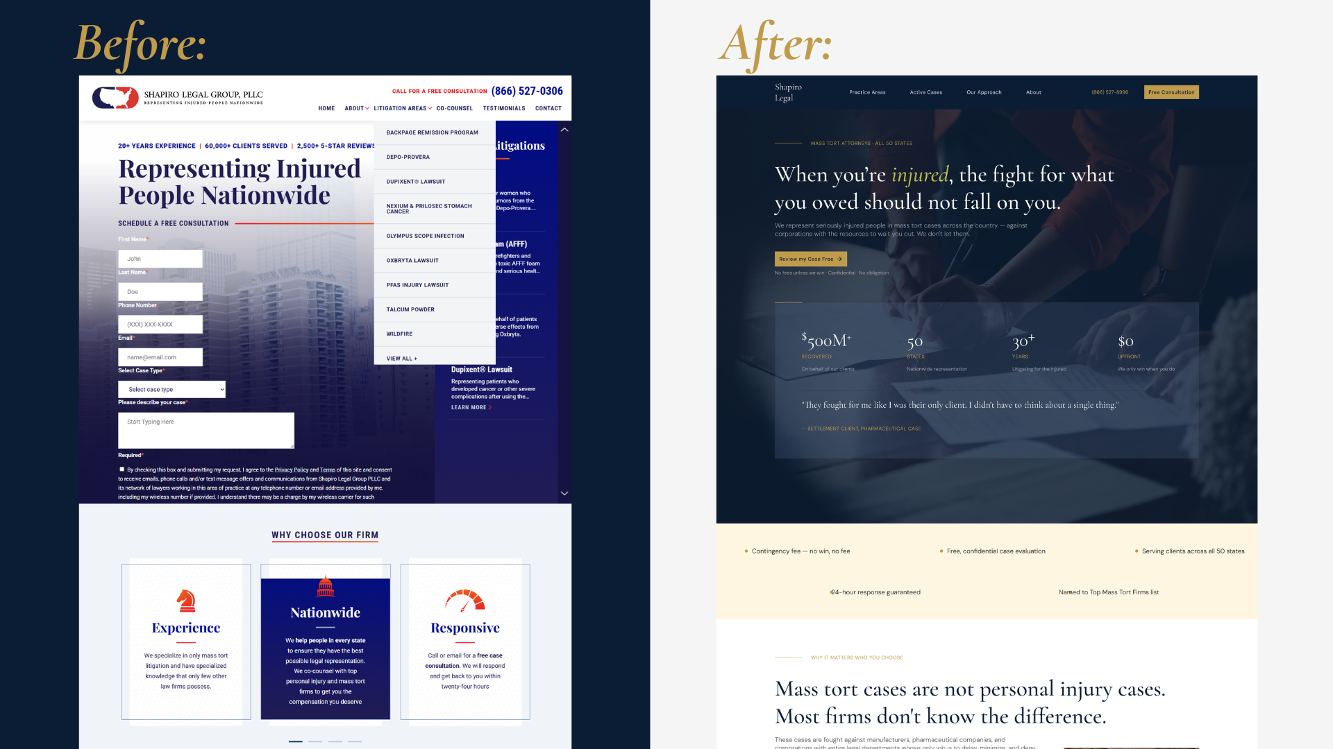
The existing homepage did the opposite of reassurance. It opened with a form before earning anything. Two more forms sat further down the page. The firm's strongest proof; 30+ years, $500M+ recovered, was buried deep in body copy, and the whole thing loaded in 18 seconds. This wasn't a rebrand job. It was a performance problem wearing a design costume.
Shapiro before and after — homepage comparison
The audit

Seven problems compounding each other.

The site had grown organically — adding sections, adding forms, adding content — without ever revisiting the core question: what does a visitor need to feel in the first ten seconds?

Before — what was failing

  • Three separate contact forms — none felt like the "right" one to use
  • Educational content competing with conversion content
  • Primary trust signals (30+ years, $500M+ recovered) buried in body copy
  • Hero opened with a form, before any trust was established
  • Inconsistent typography — 6+ size combinations, no hierarchy
  • Active litigation — the highest-intent pages — inaccessible
  • Mobile broken: oversized forms, text collision, no touch optimisation

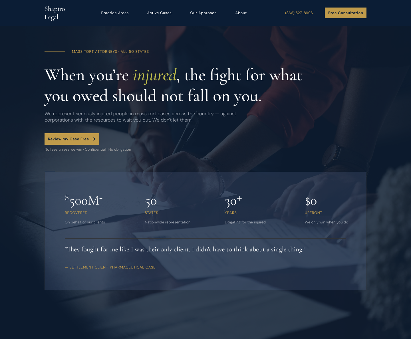
After — what we built

  • Single consultation form, positioned after trust is established
  • Educational content moved to a dedicated FAQ resource
  • Statistics in the above-the-fold hero panel
  • Hero built on a human story and a promise — the form earns its place
  • Two-font system, five sizes max: authority and clarity, separated
  • Active litigation given primary real estate with eligibility CTAs
  • Mobile-first: designed at 375px, scaled up from there
The strategy

The page had to earn each step before asking for the next one.

The redesign maps to a psychological journey — from "am I in the right place?" to "these people understand my situation" to "I'm ready to reach out." Every section earns the right to the next:

Section
Visitor's state of mind
What the section does
Hero
Uncertain, cautious. Just arrived.
Names who this is for. Establishes the firm has won, at scale. Removes risk with the fee guarantee.
Trust strip
Slightly reassured, still evaluating.
Five rapid credibility signals — fee structure, response time, reach — processed in under ten seconds.
Value prop
Beginning to believe this might be different.
Names the real difference between mass tort and general PI work — the firm that knows the category.
Practice areas
Looking to self-identify — "is my case here?"
Specific case types in plain language, anchored by an "Am I eligible?" CTA that meets them where they are.
Process
Interested, unsure what happens next.
Three steps that demystify the legal process. "Tell us what happened" is a far softer ask than "Submit your case."
Testimonial
Emotionally open, looking for proof.
One real, specific client voice. Not a rating. Not a logo. A person who was in their position and was heard.
Active litigation
High-intent visitors arrive here directly.
Surfaces the most time-sensitive cases. "Check my eligibility" — language that empowers rather than commits.
Consultation form
Ready to act. Needs friction removed.
Single form, simple fields, no jargon, reassurance copy around it. The ask arrives only after confidence is earned.
The fork in the road

Optimise the form, or move it?

The conventional conversion playbook said the form belongs in the hero — reduce its fields, sharpen its button, test its colour. It's the pattern legal templates have shipped since the early 2010s, and it's what an A/B-testing consultant would have recommended on day one.

The playbook

Keep the form first, make it friendlier

Fewer fields, better microcopy, stronger button. Faster to ship, easier to defend — and it treats the symptom. A person in crisis being asked for their details on arrival doesn't need a nicer form. They need to not be asked yet.

What I chose

Move the ask to the end of an earned conversation

One form, placed after six trust-building sections. The difference is the difference between being asked for your number the moment you walk into a room — and being asked after a real conversation.

What I gave up: immediate capture of the small minority who arrive ready to convert. That's a real cost — which is why the nav keeps a persistent "Free consultation" button for them, so the high-intent visitor always has a shortcut while everyone else gets the conversation first.

The design decisions

Every choice was made for a reason.

In this category the wrong palette signals ambulance-chaser, the wrong typeface signals outdated, the wrong layout signals cheap template. Getting it right means a visitor thinks "this is a serious firm" before reading a single word.

Near-black navy, not corporate blue

Law firms default to blue — the wrong blue. #0B1D35 reads as authority and gravity, not corporate service. This firm's visitors aren't looking for friendly. They're looking for formidable.

Cormorant Garamond + DM Sans

Serif for law isn't cliché — it's contextually correct. The serif speaks for the firm (permanence, craftsmanship); the sans serves the visitor (clarity, legibility). Five type sizes, strictly.

Active litigation gets real estate

Visitors searching "CPAP lawsuit claim" arrive with maximum intent. Their section sits after the process explainer — so by the time they find their case, they already know what happens next.

One testimonial, not a carousel

Five rotating ratings get skipped. One full-width human moment — "they made me feel like a person again, not a case number" — names the exact fear the visitor carries.

Diagonal clip-path hero

A CSS polygon edge gives the hero movement without noise — subtle enough to read professional, distinct enough to read intentional. One gold line anchors the whole colour system.

Words chosen for a guarded reader

"Tell us what happened" instead of "Submit your case." "Check my eligibility" instead of "Apply now." Language that empowers rather than commits, everywhere the visitor hesitates.

Navy
#0B1D35
Navy Mid
#142844
Gold
#C09B4B
Cream
#F6F1E9
White
#FFFFFF

What it replaced: bright red (#CC0000), corporate blue (#003399), and Arial everywhere. Not bad choices exactly — default choices, and in this category default reads as amateur. Red accelerates urgency and aggression, which are the two emotions that push a frightened visitor away. The navy, gold and cream do the opposite job. They say this firm has been doing this for thirty years and does not need to shout.

Shapiro hero type specimen
What changed

The numbers — labelled for what they are.

This is a concept project, so I label every figure precisely: measured results are measured, projections are projections. Pretending otherwise would undo everything the page just argued about trust.

Measured
18s → 4s

Page load time on the rebuilt homepage — a 14-second reduction, measured on the live build.

Measured
3 → 1

Contact forms consolidated into one clear entry point, placed where trust has been earned.

Projected
+67%

Projected increase in form submissions, based on the friction removed and conversion-pattern benchmarks for the category.

Measured
375px up

Fully responsive, mobile-first build — designed at phone width and scaled up, replacing a broken mobile experience.

"The most important thing we did wasn't design. It was decide what order the page should speak to someone in. The form can wait. The trust cannot." — From the project debrief, Kreative Cirkuit
What it confirmed

Law firm websites are a design category of their own.

The psychology is the brief.

Legal design is designing for someone making a vulnerable, high-stakes decision about their health, money and future. Authority without coldness; warmth without unseriousness.

Conversion problems are usually empathy problems.

The biggest failures on law firm sites are rarely missing features. They're missing empathy in the page architecture — form placement, section order, what gets said and when.

Strategy problems wear design costumes.

What looks like a visual problem from the outside is usually a copywriting and sequencing problem underneath. Fixing the pixels without fixing the order fixes nothing.

This is the work Kreative Cirkuit was built for.

We don't start with what looks good. We start with what the right visitor needs to feel — and design backwards from there.

Next

Meetamore: building trust before asking for it.

Read the Meetamore case study
Say hello